Today we have my first comparison.....
Trumpets sound!!!!
We are going to be comparing some of the different sky/pale blue creme polishes in my collection. I feel that this is one color that many polish companies have made dupes too and definitely a very common color.
Pretty none the less. :) I am especially drawn to this color because I love blue!!! BLUE BLUE BLUE
*sorry in advance for messy clean up, I was too lazy to clean up in between coats*
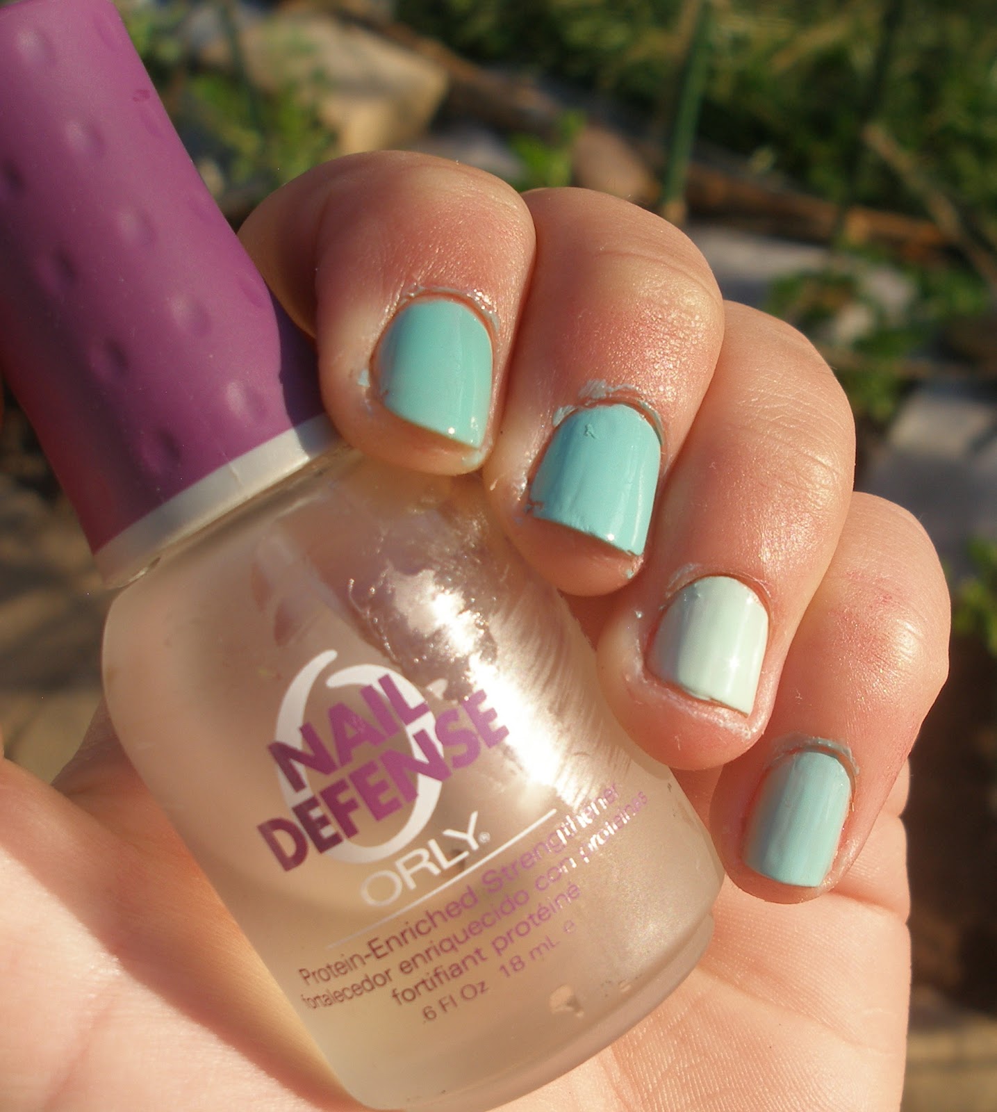
On the nail, the polishes are in the opposite order that you see here:
pointer- Essie, middle- Wet n Wild, ring- Revlon, pinky- Cosmetic Arts
 |
| Cosmetic Arts (no name), Revlon Minted, Wet n Wild I Need a Refresh-Mint, Essie Turquoise and Caicos |
As you can see, the formula for the first coat for all was a bit streaky...
 |
| direct sunlight 1 coat |
 |
| shade 1 coat |
| sunlight 2 coats |

 |
| shade 2 coats |
 |
| sunlight 3 coats |
 |
| shade 3 coats |
Conclusion: My favorite color was Essie T&C (I just loved the semi squishy jelly like feel)... a close second both color and formula wise would be Wet n Wild INRM. Revlon M turned out to be more of a pale green color. Cosmetic Arts had similar color to Wet n Wild INRM, but came in last formula wise. I think its worth it to buy both the Wet n Wild (only $1.99) and the Essie ($7.99).
Soooooo... what did you guys think?!!
I <3 comments! suggestions?!
thanks for watching!
-Katy
No comments:
Post a Comment